lgf.design

Case Study — UX/UI Design

Routini Maker
App

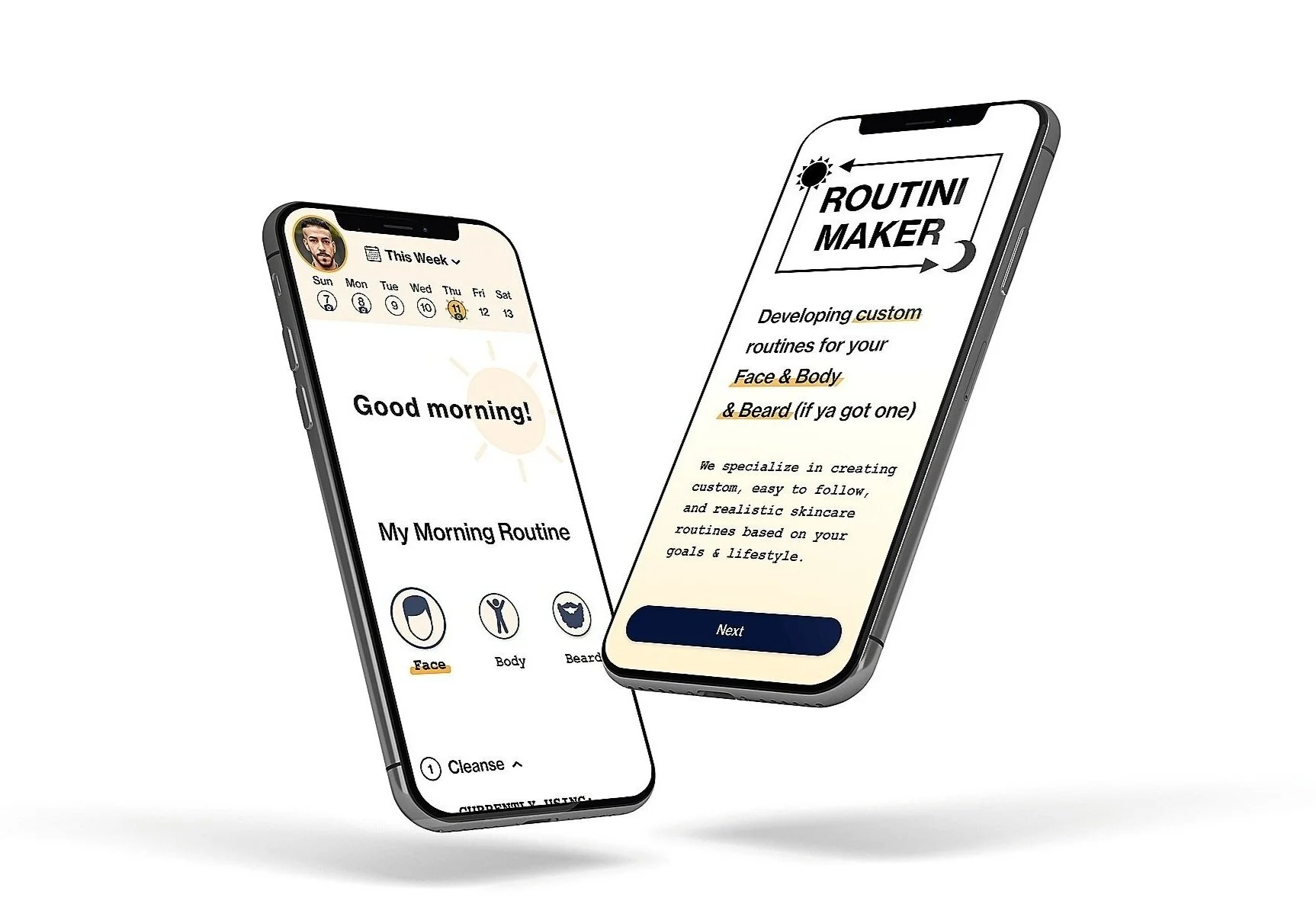
Discover customized morning & evening routines for your face, body, and beard (if ya got one). Finally, a skincare routine that's easy to follow and realistic to maintain.

UX Research Mobile App Design
Scroll
Routini Maker app mockup on iPhone

Project Overview

3 wks
Duration
8
User Interviews

Skincare for Everyone

Background

I've chosen to create a skincare app that develops customized routines for all genders. Simple yet effective, each routine is based off of a user's skincare goals while also utilizing AI facial recognition for initial assessment and day-to-day progress comparison.

Full Flow

Competitive and Indirect

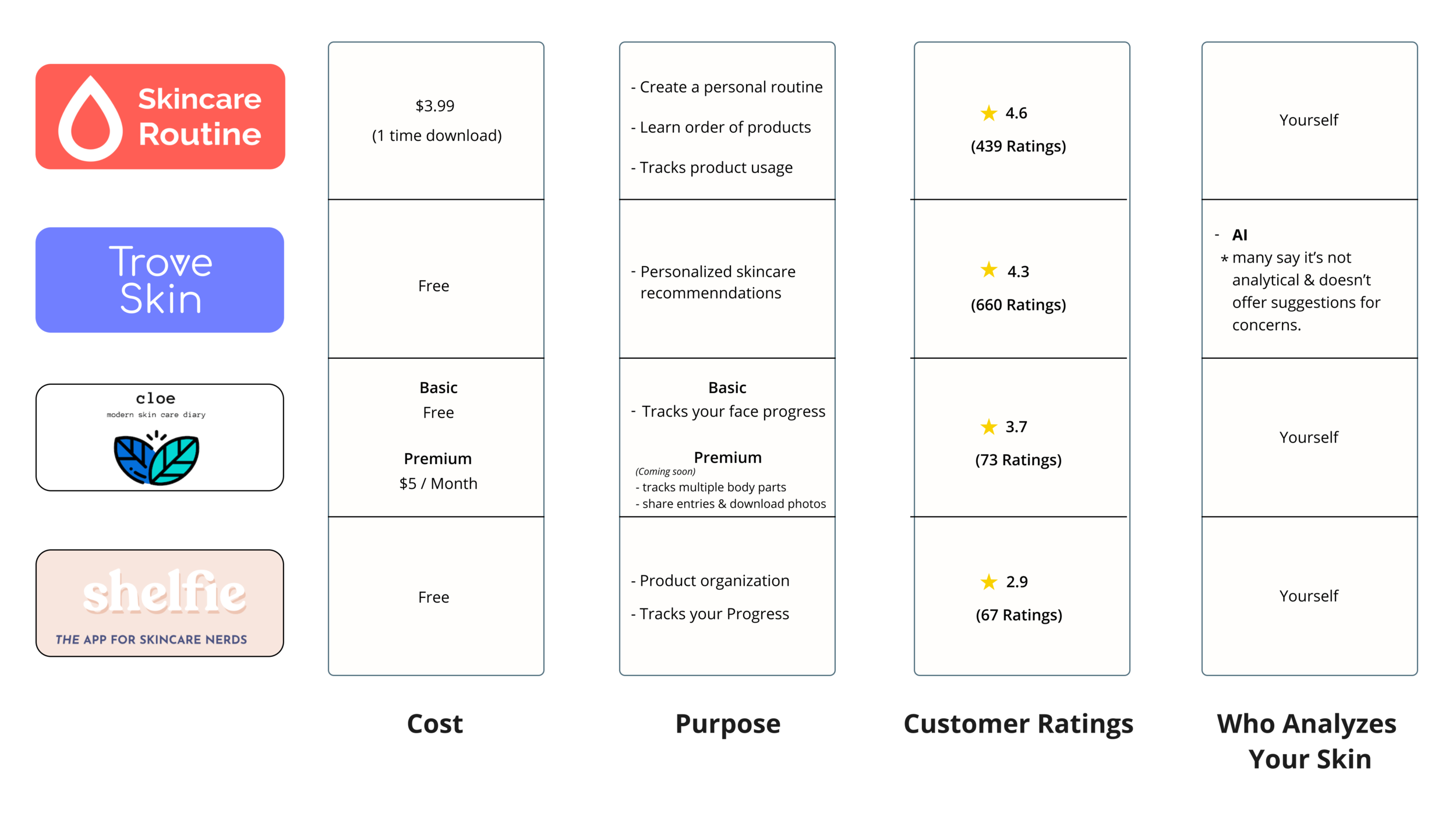
  • Analyzed the top skincare routine apps — Skincare Routine, Cloe, and Trove Skin — to map common features, gaps, and UI conventions
  • Competitors don't sell tangible products like Curology and Neutrogena 360; none encompass all the necessary features for a maintainable routine
  • Competitor apps track day-to-day progress but none combine routine creation, tracking, and education in one place
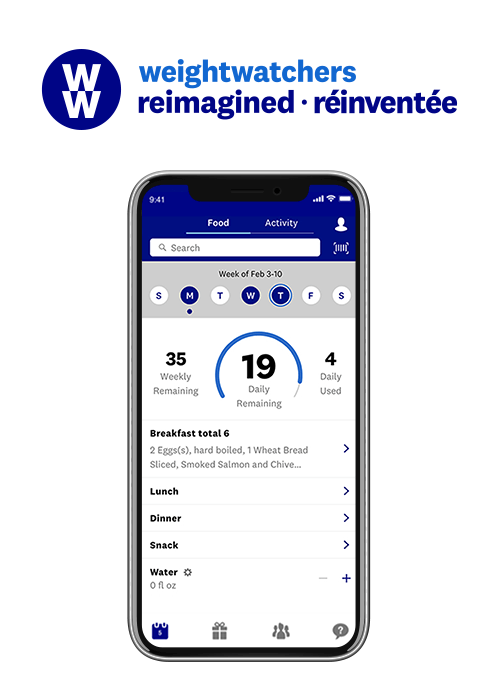
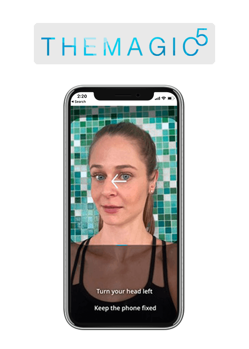
  • Researched indirect markets: Weight Watchers (established 1963) for its "sticky calendar" for single-day and day-to-day progress comparison; The Magic 5, a custom-fitted swimming goggles company, for its clear instruction and progress markings during the facial recognition process
  • Conducted user interviews with 8 participants, ages 25 to 40 (4 men, 4 women)
  • Identified that competitor apps skew feminine in UI — using purple and pink colors with rounded icons — creating an opportunity for gender-neutral design

Interview Questions

  • What does a skincare routine mean to you?
  • What do you think the benefits would be from a good skincare routine?
  • Does a skincare routine seem like it's for health and/or appearance?
  • Would seeing before and after photos inspire you to maintain a routine?

Most of the competitor apps track your day-to-day progress while a few focus on helping you create a custom routine. None of the apps sell tangible products like other popular skincare apps i.e. Curology and Neutrogena 360. The competitor apps all offer at least one important feature but they don't encompass the absolute necessary features one looks for when starting a maintainable skincare routine. Routini Maker is an app that incorporates the most important basic features such as tracking day-to-day progress, creating a customized routine based off AI advice and your own goals, offering alternate product suggestions, and giving reputable advice from a dermatologist. The competitor apps have a narrow-minded focus, only focusing on facial skincare. Routini Maker offers a broader focus, allowing the user to improve facial and/or body skincare. There's also an option to improve facial hair. The additional options offer relatability to men and non-binary genders. The competitor apps use more typically feminine UI — purple & pink colors, their icons have rounded edges, etc. which make the apps more woman gender focused. Routini Maker uses gender neutral UI — blues & oranges, icons with edges that aren't super round or sharp, etc. This allows for a more inclusive user base.

In comparison to other markets in the digital space, the skincare routine market is a newer and niche market so it makes sense that many of Routini Maker's competitors are relatively young brands. I wanted Routini Maker's similar features to be a step up from its young competitors so I decided to research more established brands in older markets that offer similar features but use better technology and/or better UX & UI.

I decided to research the health & diet market because many of the apps within this category offer day-to-day progress tracking and reputable advice offerings (from dietitians, professional trainers etc.) Weight Watchers is a long standing brand (established in 1963) that uses a sticky calendar for single day and day-to-day progress comparison. Inspired by this app, I also added the sticky calendar for single and day-to-day progress comparison.

I researched the Eyewear industry to see how different apps approach the use of facial recognition (which many eyewear brands use for measuring the user's face before ordering frames). I found that The Magic5, a custom fitted swimming goggles company, utilized facial recognition by incorporating it within user friendly UX / UI making the entire fitting process a breeze. The Magic5 app gives the user clear instruction and progress markings for the facial recognition process. These small yet important details inspired Routini Maker's UX / UI AI selfie scanning feature.

Routine Feels Complicated

All participants thought that skincare was a time consuming and somewhat complicated routine. All participants thought the benefits of a skincare routine are both health and appearance related. Women were concerned mostly about their facial skincare for appearance and health reasons. Men were slightly more concerned about body skincare and facial hair care for health reasons.

Progress Motivates

All participants agreed that they would like to see before and after photos. Men mentioned that they would like to have options for more specific parts of the body i.e. a spot on their leg (instead of just facial skincare before and after progress images).

Education Builds Trust

The participants all have an idea of what skincare is but women are more informed on how to create a skincare routine that fits their specific needs. Both men and women are concerned about skin cancer risks and would be more motivated to maintain a skincare routine if it educated them on how to protect their face and body.

Competitive Analysis Skincare app competitive analysis chart
Indirect Market — Weight Watchers Weight Watchers app calendar screen that inspired Routini's progress tracking
Indirect Market — The Magic 5 The Magic 5 app facial recognition screens that inspired Routini's AI selfie scanning

Persona, Flow and Sitemap

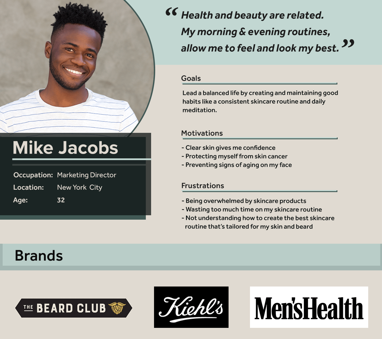
Interview findings pointed to a clear user type: someone who wants to build a skincare habit but finds existing options either too complicated, too gendered, or too narrow in scope. I created a male user persona to center an underserved perspective and drive structural decisions.

Key insights

  • Users want routine customization that covers face, body, and facial hair, not just face
  • A daily selfie-based calendar for progress comparison was the most motivating concept tested
  • Icons and language must feel gender-neutral, avoiding symbols or colors associated with one gender
User Persona Routini Maker male user persona
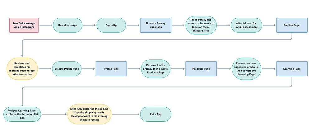
User Flow Routini Maker male user flow diagram
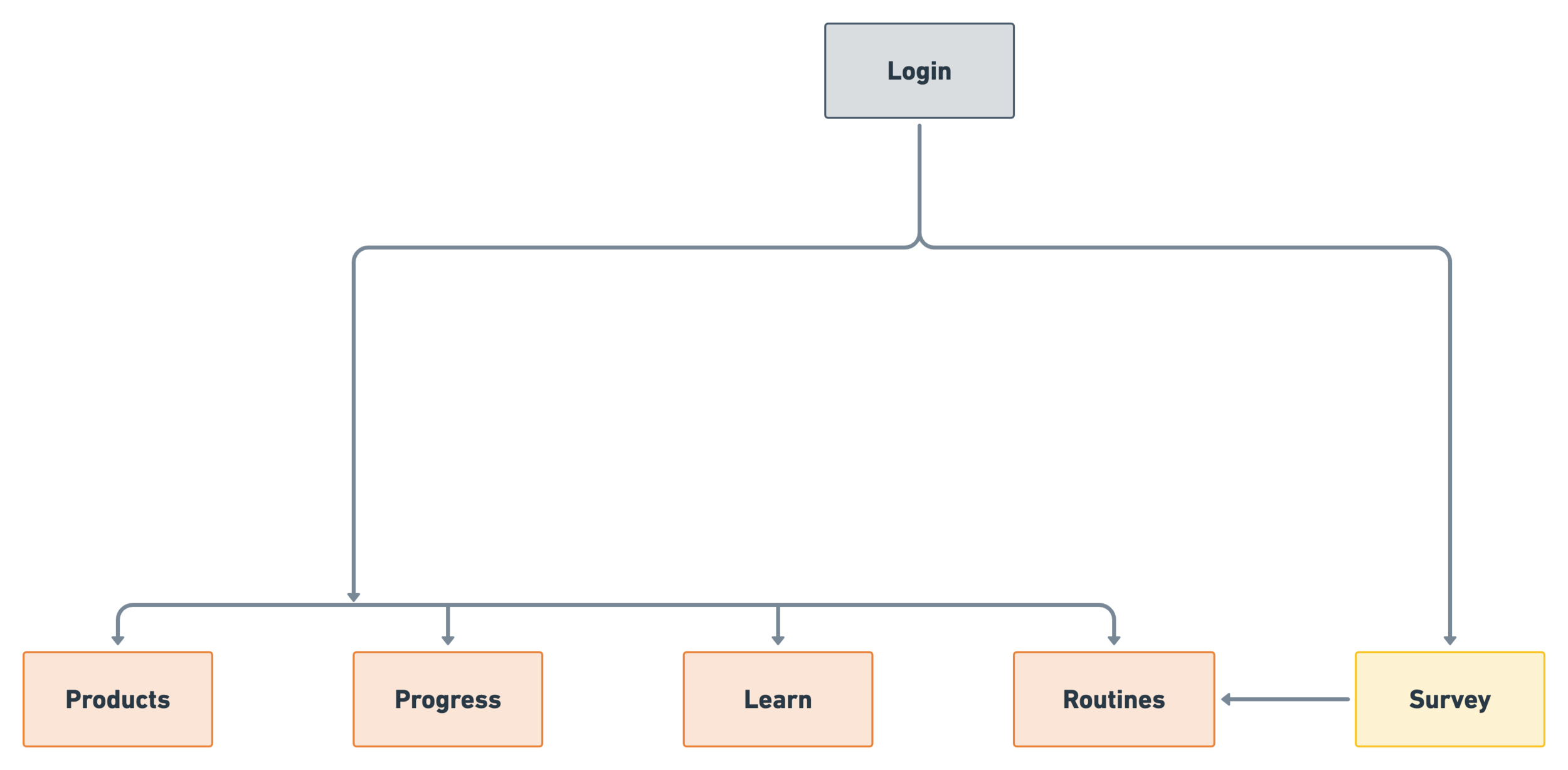
Sitemap Routini Maker app sitemap

Wireframes to Final Flows

UI Kit

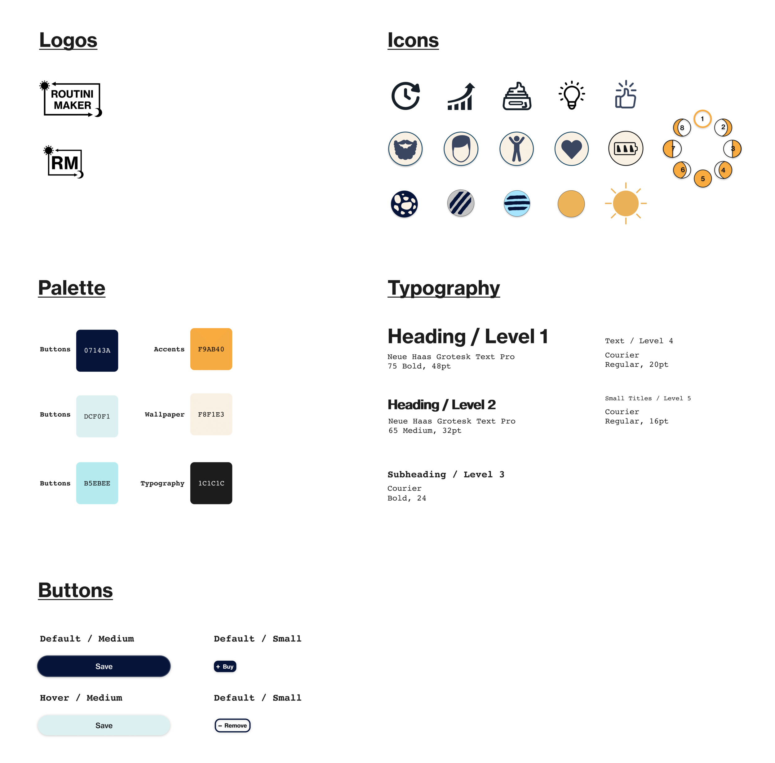
It was important to keep the color palette gender neutral so I stayed away from typical female colors (pinks) and male colors (greens). I used icons that are already familiar to the user / commonly used in the digital world (i.e. the battery icon is similar to the iPhone's battery icon, the thumbs up icon is similar to Facebook's 'Like' icon.) Sticking with the familiar and simplistic theme, I used sun and moon icons several times throughout the app (i.e. within the logo, to represent the user's progress during the intro survey, and on the routine, profile, and product screens wallpapers to represent if the user was viewing the app during the morning or evening.)

Final Prototype

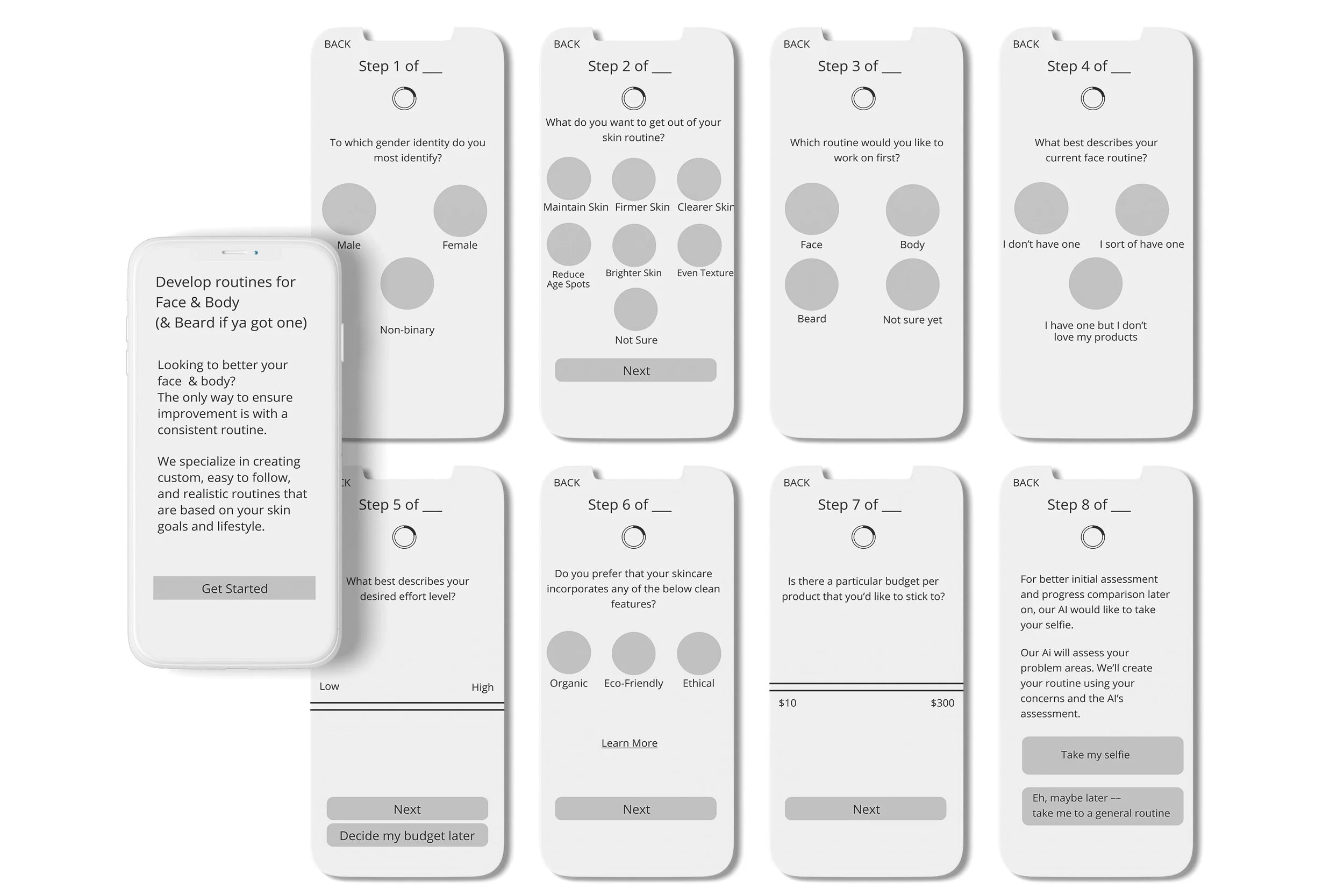
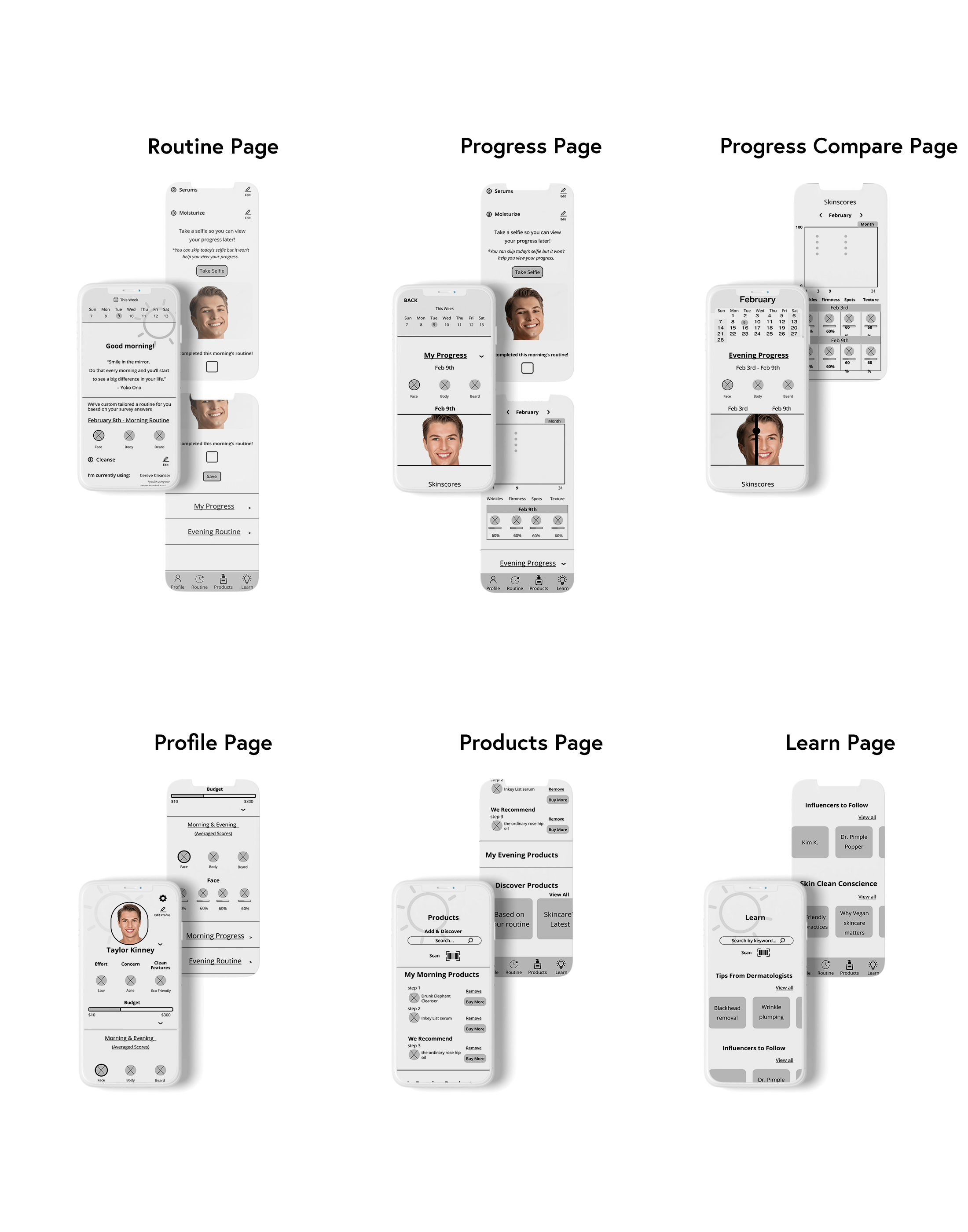
The final design covers 6 flows: Intro Survey (including AI selfie scanning), Routine, Progress, Products, Profile, and Learn. A high-fidelity Figma prototype was usability tested with 5 participants (3 male, 2 female).

Survey Wireframes v1 Routini Maker initial hand-drawn wireframes of the intro survey flow
All Wireframes Routini Maker digitized wireframes for all app flows
UI Kit Routini Maker UI kit with color palette, typography, and icons

Final App Flows

Please note that the Intro Survey flow represents a different date than the Routine and Progress pages flows — this is to best exemplify the selfie day-to-day progress comparison.

Intro Survey Flow
Progress Flow
Routine Scroll
Products Scroll
Profile Scroll
Learn Scroll

Simple Yet Effective

Usability Testing

Using Figma, I created a high fidelity prototype for the mobile app. I conducted remote usability testing with 5 total participants — 3 male participants and 2 female participants. I gave the users one situational task based off of a real life situation. You can test the prototype yourself.

All participants commented that they loved the UI — the icons and color palette were simple and neutral yet feel trendy and go with the simple yet effective UX. All of the participants were enthusiastic about actually using Routini Maker (if it were a real app) because of its gender neutral aesthetic, straight forward education feature (Learn page), and option to create / track a skincare routine for more areas than just your face (i.e. full body skincare and facial hair routine options). All participants thought that Routini Maker would inspire them to begin and/or maintain a skincare routine because it would give them positive appearance and health results.

Key Insights

  • Users are willing to follow a skincare routine that is custom created for them, offers skincare routines for more than just your face, is easy to maintain, shows their day-to-day progress, is educational, and gives promise for positive health and appearance results.
  • Users are enthusiastic to follow routines when they better understand their purpose and know it's created with their specifics in mind. They love the flexibility of learning about skincare from a variety of people (dermatologists and influencers).
  • Creating a skincare app that's gender neutral feels most appropriate for today's society where gender norms are becoming outdated.

Challenges & Decisions

UX Challenge: A simple yet effective way to customize and track your skincare routine.

UX Design Decisions: Use AI and user survey results to create a custom routine for the user (for multiple parts of the body i.e. face, body, facial hair). Create a daily selfie and calendar system where they can note daily skincare routine habits (the Routine page) and also compare their progress (Progress page).

UI Challenge: Create UI that appeals to both genders and is trendy making it stand out from its competitors.

UI Design Decisions: Create UI that focusses on being gender neutral (color palette, icons, etc.) Create UI that is already semi familiar to the user (i.e. similar calendar system to Weight Watchers, etc.)

Next Steps

To create additional flows for the Routine and Progress pages — i.e. an evening routine for the face, and morning/evening routines for the body and facial hair. After, I would perform additional usability tests and update the design and prototype based off of the user feedback.