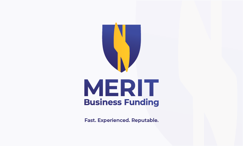
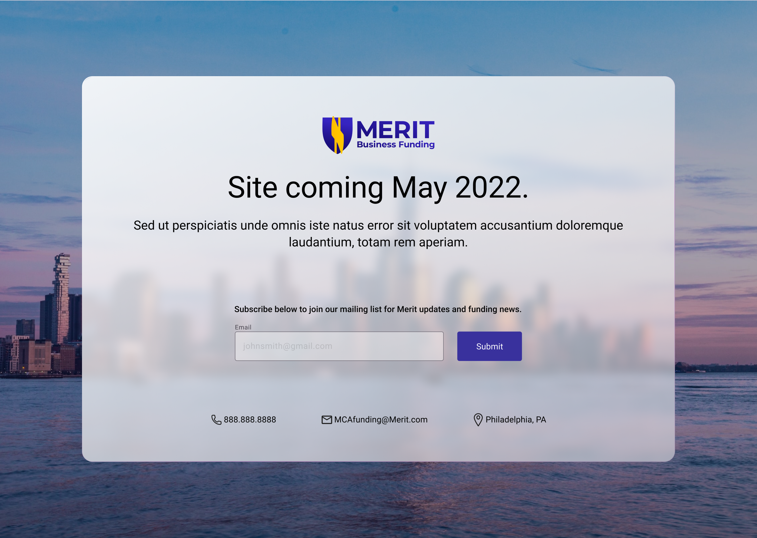
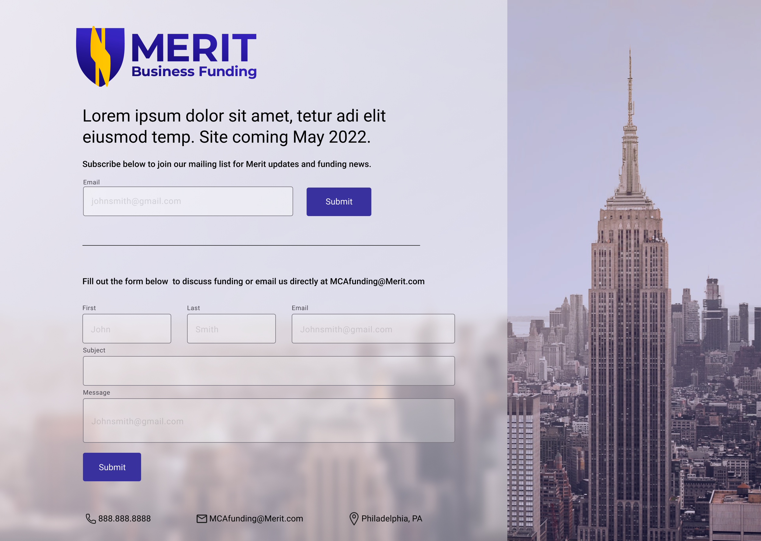
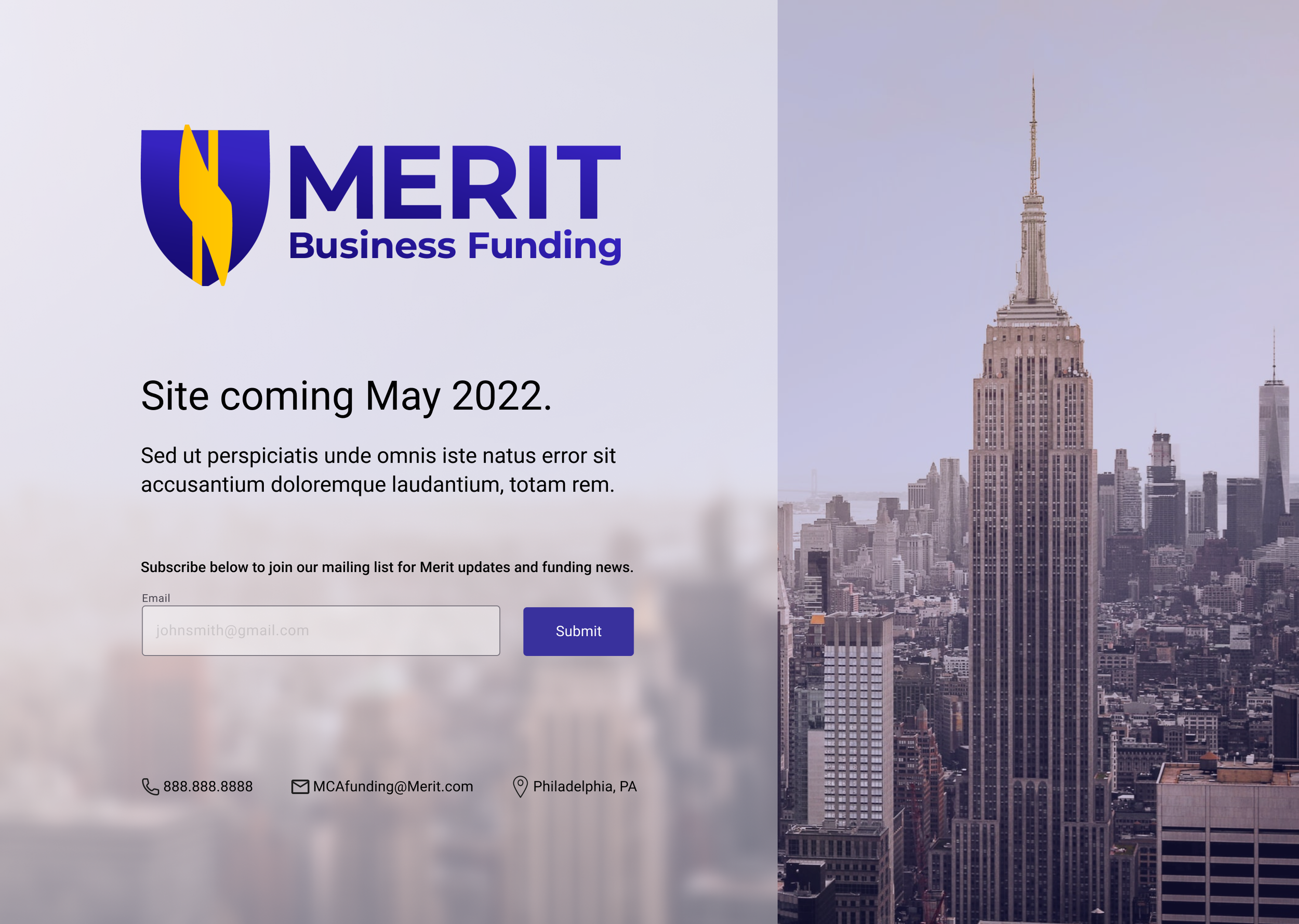
lgf.design

Case Study — Brand & UX/UI

Merit Business
Funding

61-page brand style guide, print collateral, and website for a fintech startup.

Brand Identity UX/UI Design
Scroll
Merit Business Funding project mockup

Project Overview

61
Page Brand Guide
1
Designer

Build a Brand from Scratch

Background

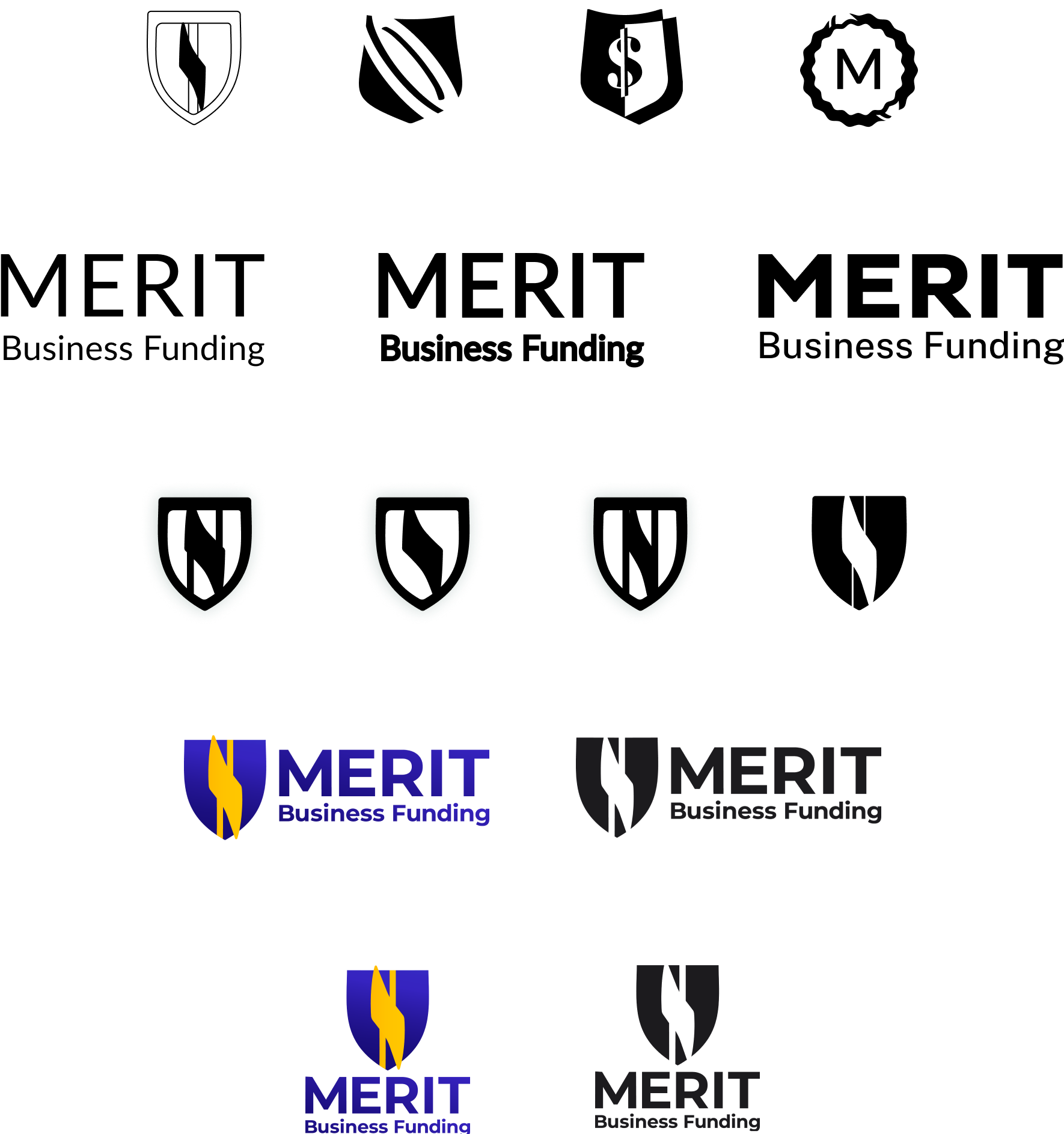
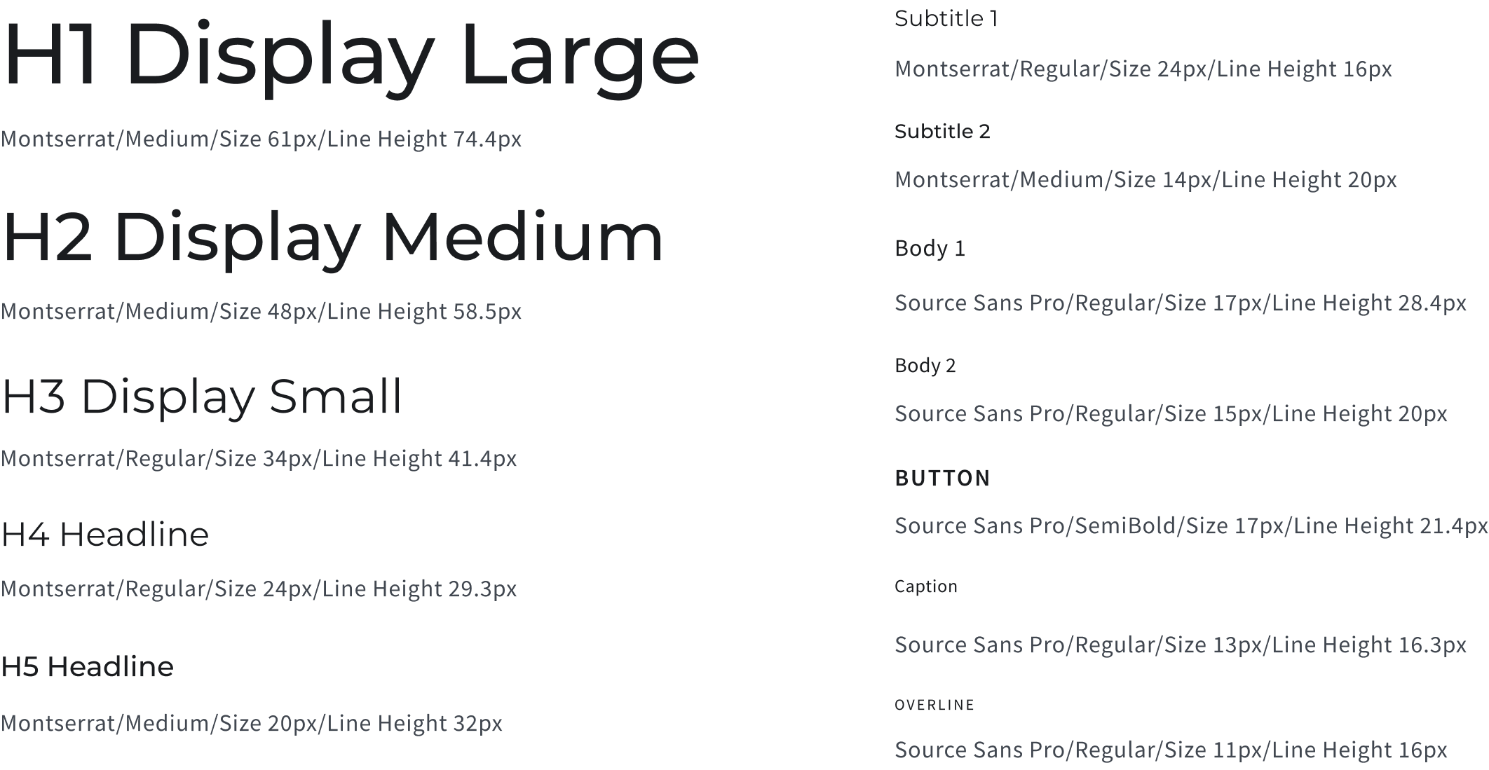
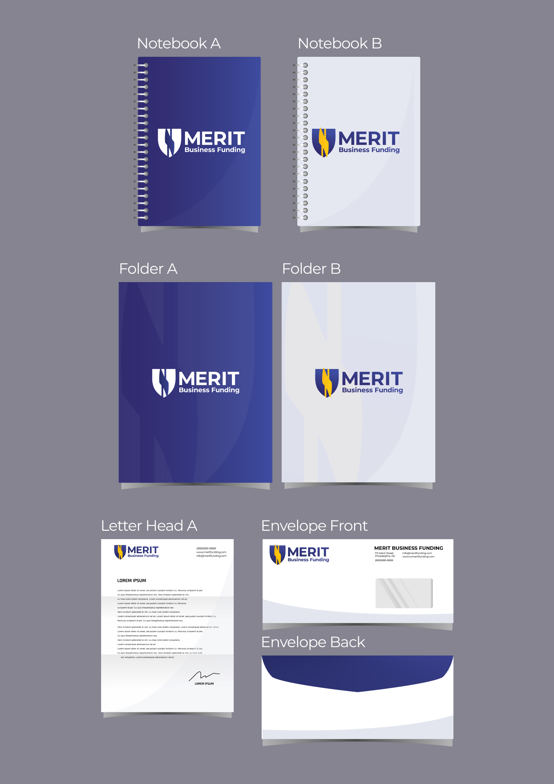
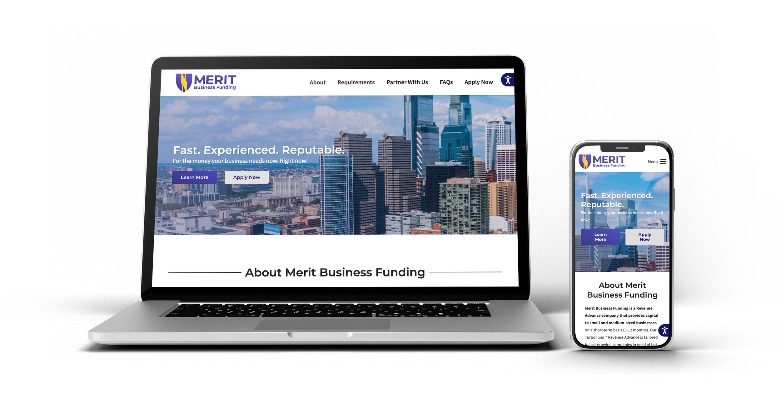
Merit Business Funding came in as a referral from Meridian Bank. The ask was total: a fintech startup with no existing visual presence needed everything built from scratch. Logo, color system, typography, icons, print collateral, merchandise, a 61-page brand style guide, a UI kit, a presentation template, and a full website.

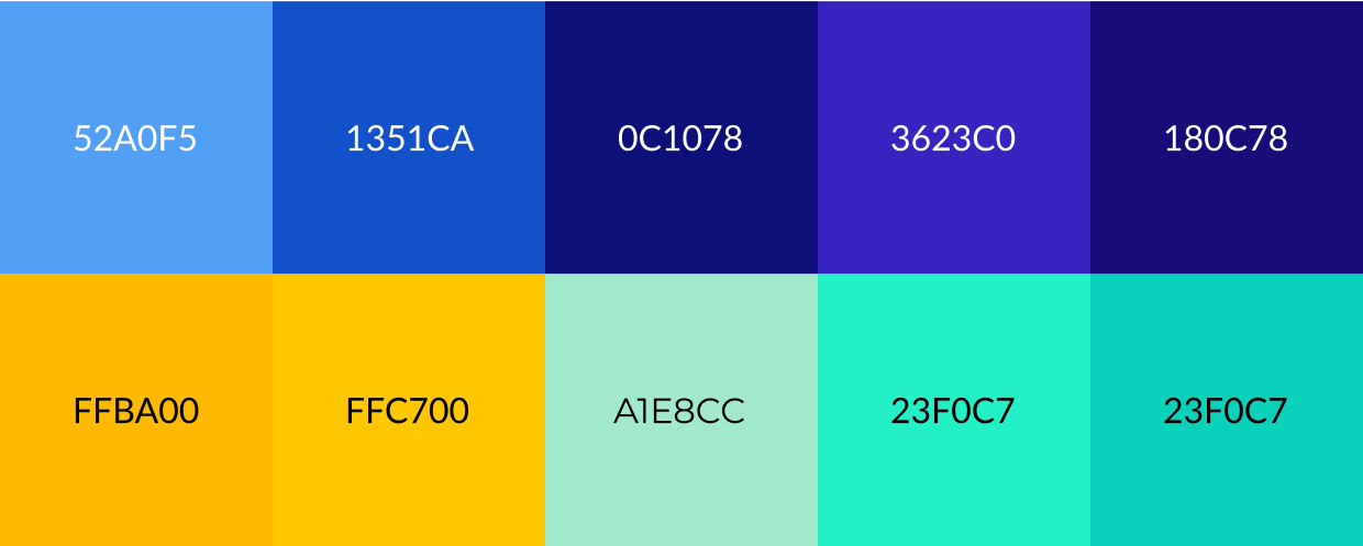
As the sole designer across brand and UX, every visual decision was mine to make. For a startup in fintech, that weight is real. The brand needed to communicate trust and financial credibility — while standing out from a category full of established competitors using the same safe visual language.

Building a Visual Identity

  • Logo exploration across shield, lightning bolt, and circle shapes — each carrying different meaning (trust, speed, continuity)
  • Two mood boards presented with distinct color pairings for client review
  • Initial blue-yellow direction revised after identifying proximity to established competitor palettes
  • Final palette: purple-blue and yellow fusion — distinct, energetic, and unambiguously Merit
  • Typography pairing: Montserrat for headings, Source Sans Pro for body text

The color decision was the most consequential of the entire project. Blue and yellow are default fintech colors for a reason — they work. But working for everyone means working for no one. The initial direction was too close to established competitors to give Merit any real visual differentiation. Pivoting to purple-blue and yellow gave Merit a genuinely distinct identity while keeping the trust and energy associations that matter in the category.

Mood Board — Blue / Yellow Merit mood board option 1: blue and yellow color palette
Mood Board — Purple / Yellow Merit mood board option 2: purple-blue and yellow color palette

From Logo to Launch

Brand Collateral

Business cards, letterhead, folders, notebooks, and merchandise — each carrying a signature purple triangle corner motif that echoes the shield curves in the logo. The motif was designed to feel intentional rather than repetitive: present enough to build recognition, restrained enough not to overpower.

61-Page Brand Style Guide

A 61-page guide isn't produced because a client asks for one — it's produced because a brand system is complex enough to require that level of documentation. This one covers logo usage rules, color values, typography specifications, icon design, and the decorative elements (diamond patterns referencing wealth, 3D shield patterns establishing quality tone) that give Merit its distinct visual texture.

Website

The website was intentionally concise — a reflection of Merit's early stage, not a limitation of the design. Jump-link navigation drives service discovery without overwhelming a first-time visitor. A UI kit and presentation template were delivered alongside the site so any future design work could stay on-brand without needing the original designer in the room.

Logo Variations Merit Business Funding logo variations
Color Palette Merit color palette
Typography Merit typography system
Icons Merit custom icon set
Decorative Patterns Merit decorative patterns including diamond and 3D shield motifs
Print Collateral — Notebooks, Folders, Letterhead, Envelopes Merit print collateral including notebooks, folders, letterhead and envelopes
Mug Merit branded mug
Cap Merit branded cap
Business Card — Front Merit business card front
Business Card — Back Merit business card back
Brochure Merit branded brochure mockup
Presentation Template Merit presentation template slide 1
Merit presentation template slide 2
Merit presentation template slide 3
Merit presentation template slide 4
Merit presentation template slide 5
Splash Page — Option 1 Merit website splash page option 1
Splash Page — Option 3 Merit website splash page option 3
Splash Page — Option 4 Merit website splash page option 4

A Cohesive Brand Voice

Merit launched with a brand system built to scale: a complete visual identity, a style guide thorough enough to onboard future designers without my involvement, and a website that accurately represents the company's positioning.

The referral from Meridian Bank that brought this project in reflects what I aim to build with every client engagement — work that generates trust, not just deliverables. Getting referred to a startup's founding team because a regional bank trusted the work is the kind of outcome that matters.

View live site ↗