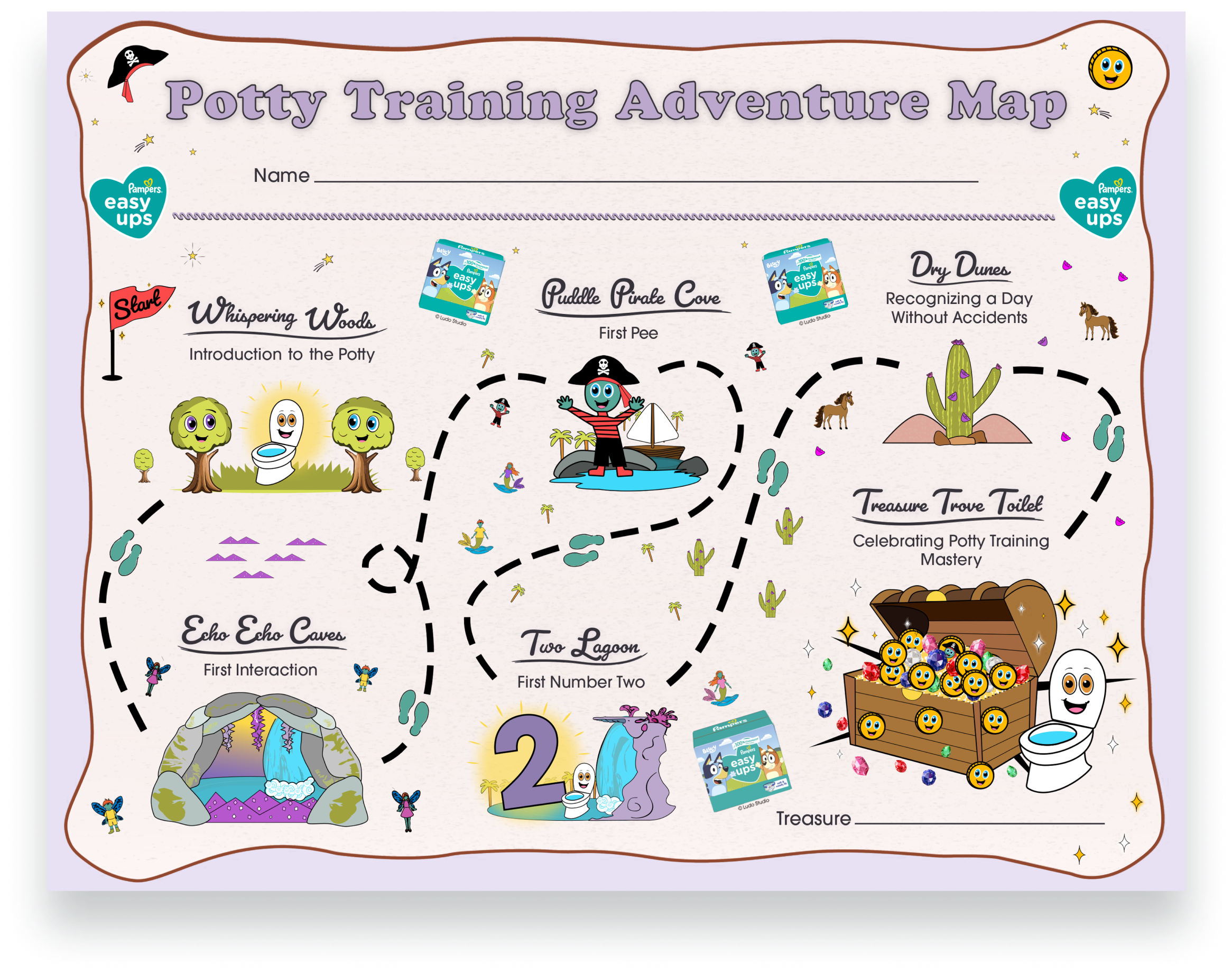
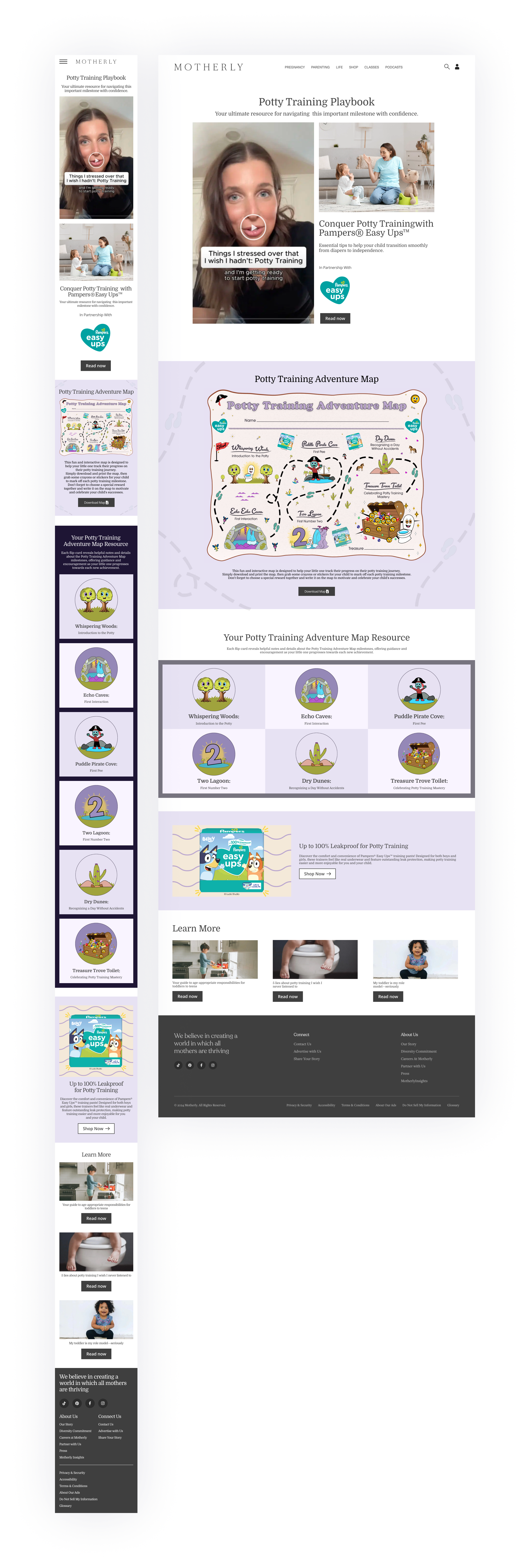
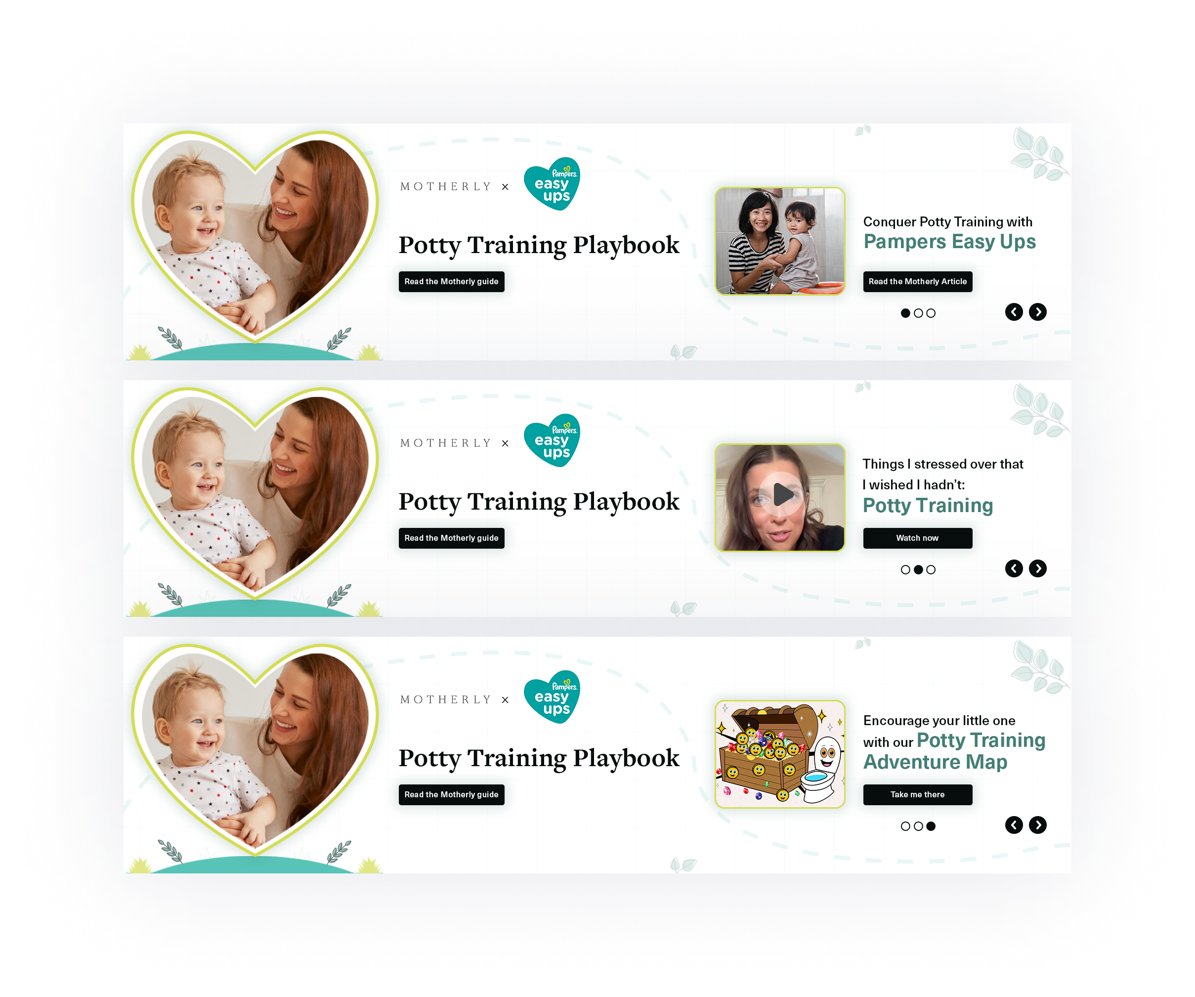
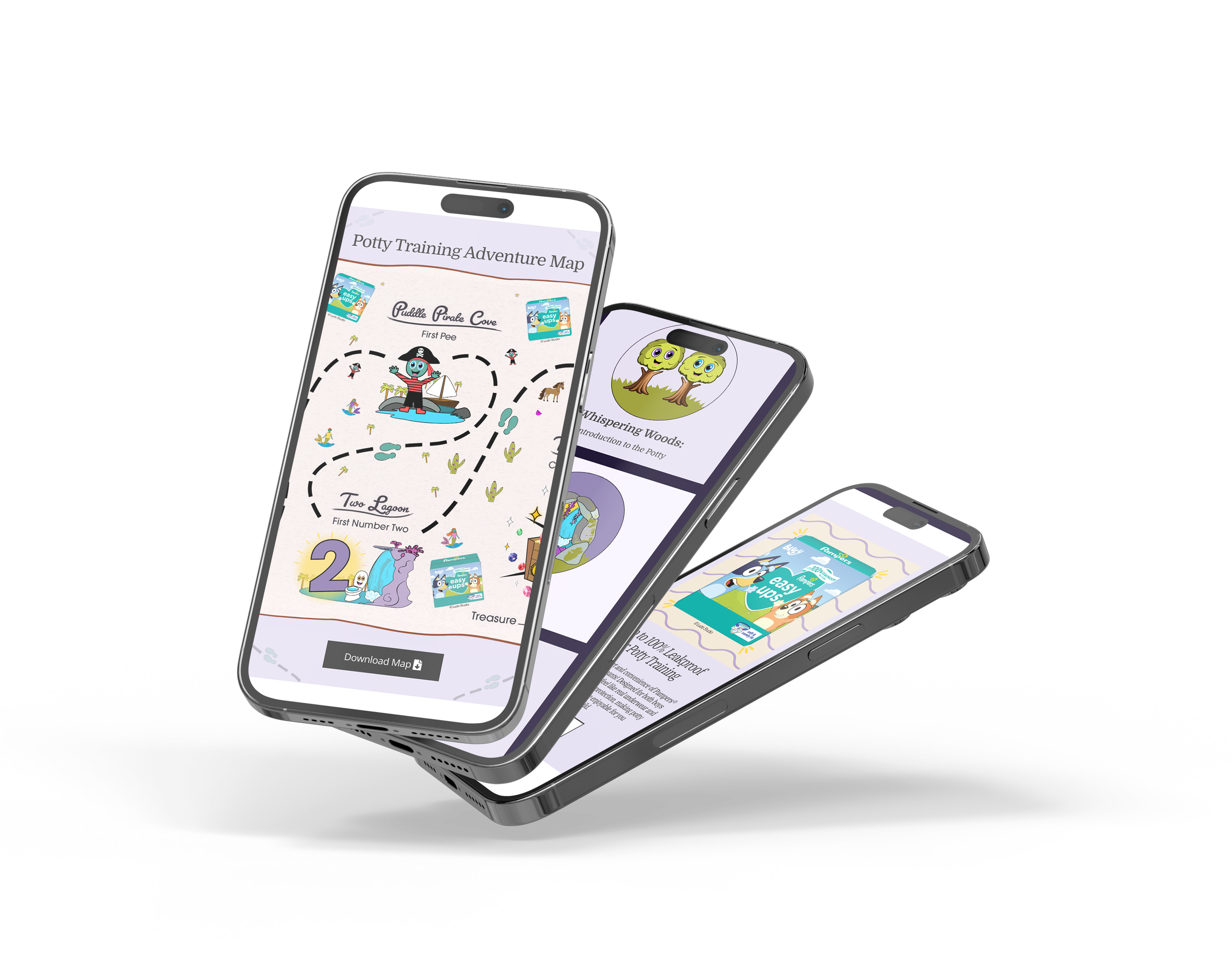
UX & graphic design for brand collaboration


Objective

Design/build a landing page, an educational map, and a carousel banner ad.

Background

Motherly, a brand focused on helping mothers thrive and succeed, asked me to do UX and graphic design for a brand collaboration. I was hired as their sole UX and graphic designer to design a mobile first landing page, an original educational map, and a carousel banner ad.

View live site.


Project Kickoff — Banner Ads


The project kicked off with the carousel banner ad design. The brief was straightforward and since I’ve previously worked with the client I already understood the brand tone. I knew it was important to make the assets cheerful and whimsical.

I provided the client with two options. Both options follow their brand colors, consist of original assets, and feature images I sourced from Adobe Stock. The client decided on Option 1 — they appreciated that the ads colors and heart frame match closely with the collaborating brand’s colors and logo shape.

Option 1

Option 2


Landing Page


Create a mobile first design

I built this page using a website builder and started with the mobile build. I adjusted the desktop and additional breakpoints based on the mobile’s. My knowledge of HTML/CSS proved useful as I had to make specific adjustments for mobile and tablet breakpoints.


The page layout is inspired from the client’s other landing page brand collaborations. I designed the color wireframes directly in the website builder using the client’s global brand library.


Original Asset Design


Educational Map

This was my first time illustrating a map and it was a blast! I used Pinterest to find inspiration and designed the map using Procreate, Illustrator, and Photoshop. The trickiest part of this design was making sure all assets looked sharp whilst keeping the pdf file size as small as possible.

In total, the design time was ~10 hrs.


Creating Engaging Movement — Flipgrid


Expanded Tips

The flipgrid accompanies the educational map. The front cards match the map’s numbered steps and the back cards feature detailed potty training tips.


Final Outcome


The client was happy with the landing page, the educational map, and the carousel banner ad. There were no notes which was a huge compliment. The project was a success and I’m looking forward working with them again in the future.

 
Previous
Previous

Merit Business Funding

Next
Next

Copywriter's Portfolio